OKCupid 2020 re-design and innovation
When I joined OKCupid in 2019, OKCupid already has large user base and positive revenue stream. In the 13 years of OKCupid history, it has collected a rich user data and went through the change of dating tech industry. There are many flaws in the product tough the years. When OKC expend itself globally, the newly formed tech team wants to push the product to a new vision. Using the legacy of the company to create a new way to date, differentiate itself from the other dating apps like Tinder and Hinge.
Visual re-design and new design system
In the process of re-designing the app, I worked as part of the product team under the lead of our CPO. We re-designed the visual branding and build a new thoughtful design system to make the 2020 marketing champaign and product as a cohesive brand.
Because OkCupid has such a long legacy, redesigning the design system is very challenging. In short, We aline the 2020 marketing campaign and our visual style. Nail down the color skins first then apply them to the existing UX structure. Slowly simplify and polish into the new look and design.
OKC 2020 - Design system
Case 1 - New matching mechanic
What is the current matching mechanic:
Swiping left and right to like and pass on profiles is the most popular mechanic. It is a very linear and quick behavior. Mutual likes will become a match. Users can start conversation if matched.
The old design and problem:
OKCupid has rich users’ data, it is one of dating apps care about in-depth user profile. OKC has the ability to filter and organize potential matches for user into different categories. However, under the current UX structure and UI design, data shows more than 80% users barely know there are different way to browse people. Most users only stay on the first tab and swipe through profiles.
Business goal and KPIs:
OKCupid wants to create a better eco-system that can help users to match better. In dating app industry, most revenue comes from “See who likes you” feature (which is part of the subscription package). Help users to navigate around different profiles can help them to discover more potential matches.
Better recommendations = Sending more likes = More people like you = More revenue
KPI: 1. Longer screen time 2. Send more likes per user.
Old DoubleTake tab design
Old Discovery tab design
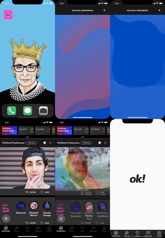
New design with stack menu bar
New design - Stack Pass
New monetization strategy, a la cart pass. (outside of subscription plan)
Future iterations and prototypes
More stacks and more personal customization, such as music and books stacks.
Add a pull-down stack homepage. Which can has more content and entry point for future expansion.
Build more question based quiz to engage users, such as political and religion questions.
User can view who has the similar answers after they finish the quiz.
In this way, we can increase engage rate and use the answers as part of the user profile data.
Case 2 - Boost with creative cadence
What is Boost:
Boost is a feature very common in dating apps. When start boosting, it will allow users to have more explore to other users. Boost is currently the second biggest source of revenue.
The old design and problem:
More than 80% users only stay on the first tab. However there is no entry point on the first screen for Boost. Users have to go to “Likes” or “Profile” tab to start boosting.
Business goal and KPIs:
As the second biggest source of revenue. We want let users to access Boost on the first screen of the app, but not creating additional button on the screen.
KPI: Increase Boost revenue
Design result:
We created a card for boosting in to middle of user profiles, also applied creative cadence for different user base. For example, Straight male users has more frequent swiping rate, their boost card will appear every 20 user profiles. For female users (who has much lower swiping rate), their boost card will appear every 8 user profiles.
We have successfully increased Boost revenue by 15%.
Case 3 - Read Receipt A La Cart
The problem:
Read Receipt feature has always been a part of the subscription package. However, subscription plan is too expensive for some users and usually Read Receipt is not the major reason of why user purchase the subscription package. From user feedback, we find users has big interest in purchase Read Receipts, but they do not want to pay the membership for just read receipt.
Solution:
Take Read Receipt feature out of the subscription package. Make Read Receipt a one time payment feature with lower fee in the chatting thread.
Business goal and KPIs:
Give users who do not want to pay membership a way to purchase Read Receipt feature. Generate more revenue from Read Receipt a la cart.
KPI: 1. More user activate Read Receipts through purchasing Read Receipt a la cart.
Design result:
Read Receipt activating rate has increased by 5%
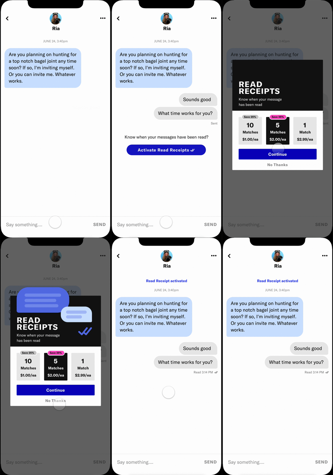
Read Receipt purchasing flow
User can activate read receipt from clicking the CTA. In the rate card, it provide options of different quantity in different price tiers.
Read Receipt activating flow -for users who has purchased multiple Read Receipts
Users who has purchased more than 1 Read Receipts can activate Read Receipt by swipe the top toggle.


